Now that I have finalised what I aim to create for one of my final outcomes, I can begin to develop my idea enabling me to find the best one. Below shows the development stages I went through in order to create my final design.
Tools used: Photoshop CS5.5, Indesign CS5.5
Proportions: At full size it will be A3, but it will be folded down to an A5 size. It will form a concertina effect.
I wanted to create a simple, but elegant design to my handout. This is where the thought of turning an image into black and white would be useful. I feel that a black and white colour scheme works well as it can give a piece of design, a modern and sophisticated feel. I wanted to emphasis this look by providing a modern font. However, the default fonts that I was provided with on photoshop didn't give me the style I wanted, so I opted out for a font called Harbara located on Dafont.com. As you open the spread it will reveal a page of information about my sister and what the article will be about. It then goes onto an interview.

Before I could continue with developing my concept further, I realised that the idea I had wasn't working. This forced me to rearrange my layout and experiment with imagery. The same idea would follow as about (concertina) but using a different layout and imagery. I firstly changed the font on the front cover to serif type. I chose to do this as I felt this gave off the modern look I was looking for. I also decided to include my short biography of my sister on the bottom. As you open the spread an image slightly smaller than A4 will be shown, this would include the interview section. I also thought it would be a good idea to include small captions to each image, to explain to the reader what their about.
The same process is repeated on the next page. Once opened fully the handout will be at A3 size.
In the end, I decided that I didn't really like how the design was going, so chose to expand my thoughts by providing a more interesting and unique approach. The changes I made are as follows.
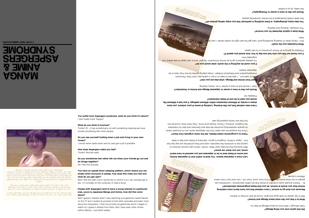
In the end I decided that I didn't like the outcome of my first idea and came up with the idea of using polaroid effect images for my design. I have always loved images that have been taken using a polaroid camera as I feel the colour and style give a vintage and elegant look. I chose to use an image of my sister and place it with an polaroid template (this was also produced on photoshop). I then thought it would be a good idea to include the information along the bottom of the image. I wanted to give the image a more personal touch, to do this I used a handwriting style font. It was then that I located a font called Dakota found on an Apple Mac's default font preferences.
The same effect was used to create the image on the inside spread of the handout. By experimenting with different layouts it has given me opportunity to see what looks best and stands out well.
I personally feel that the bottom image works best as the flowing design makes it more pleasant and understandable to look at.