As a group, we were asked to listen to piece of music that we wouldn't normally listen to. Our task was to visually communicate our thoughts, feelings and ideas on how the chosen song made us feel and how it could look visually. I decided to choose Slipknots - Psychosocial. The video below is the song I have chosen. Please feel free to have a listen to give yourself a clearer idea on how my outcome could look.
After listening to the song, a variety of different thoughts cropped into my head on how this song and video makes me feel and how it could look visually. They are as follows:
Angry
Despressed
Arghhhh!
Black
Tiger
Red
Blood
Snake
Mosh - Excitable
Fighting
Shark
Scratches - Cuts
Rotweiler
Gun
Jagged shapes
When researching for possible ideas to create my design. I came across and image of Andy Warhol's gun. This then gave me some inspiration to produce my own image in the style of this.
I took a photo of myself pulling an angry face to represent the angry and 'arghhhh' side of the song. Using several layers and threshold options on Photoshop, I arrived at this design. The colour I have used for the design also gives the impression of either blood - fighting and anger.
This is the mindmap I have produced using images, materials and paints to express the above the list. Rummaging through the house, I managed to locate a variety of different materials with a rough surface, these include: a dead leaf and an old hessian bag. I also decided to splat areas of the page in red and black paint to give ti idea of anger and blood splattering across the page
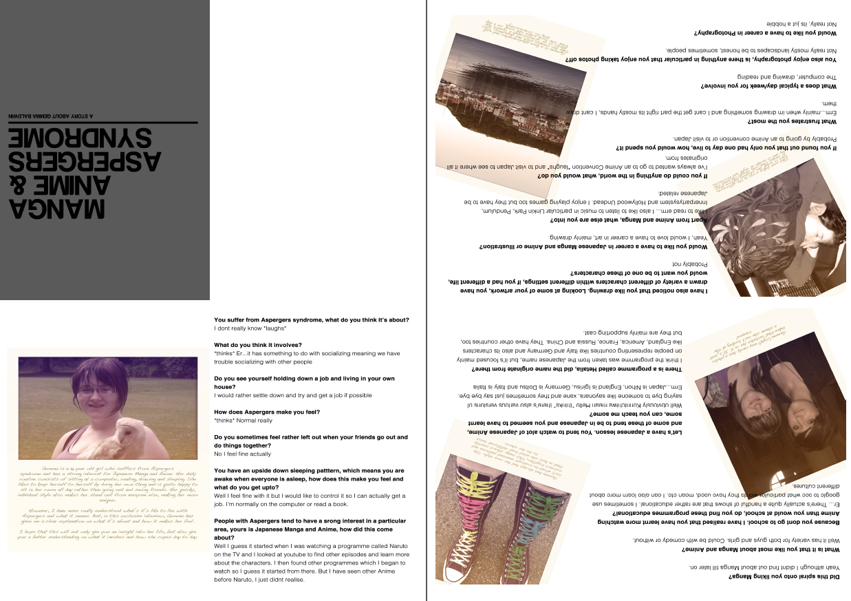
As part of my visual communication brief I was asked to create a piece of design work based on Andy Warhol’s ‘fifteen minutes of fame’ theory. This could be based on anything from a person to an object, to an experience or lifestyle. Once chosen, my idea had to be produced into an supplement found in wallpaper magazine. The idea was to give someone/something fame and recognition for their work for fifteen minutes.
To begin, it sought me produce a series of brainstorms which would lead onto finding a possible theme to base my supplement on. I came up with a range of ideas these included: a pole dancer, teenager, tattoo artist, model, my sister, football fan, photographer (paparazzi) and more. Eventually I rose upon the idea to use my sister as part of my brief. I thought this would be a good idea as I find my sister has a rather interesting personality and lifestyle. The reason being is due to the fact that she is an Aspergers sufferer who also has an upside down sleeping pattern and has a very strong interest for Japanese manga and anime.
To enable me to get a better idea on how my idea should look, I needed to do some research. I firstly looked into Wallpaper magazine to see what it entails and how I could fit my idea within the magazine. I also looked at the meaning behind the ‘fifteen minutes of fame’ theory. An example I found that really stood out to me was the poster designs created for the tramlines festival in Sheffield this year. The design included images of different people with the slogan ‘free for (name)’. I found this worked really well as these were situated all over Sheffield and the surrounding areas giving each person used on the poster their own ‘fifteen minutes of fame’.
As my sister has a strong interest for Japanese manga and anime I felt it would be a good idea to research into these areas as well as the Japanese culture to give me a better understanding on what they are about. I noticed that manga and anime seems to be quite similar with how they use illustrations and colour. I also like how they give off a rather humorous look. If you watch an anime programme, you can see how the designer uses lines and expressions to give the viewer an example on how the character feels. I also chose to research into Asperger’s syndrome to give me and the viewer and better understanding on what it involves.
Now that I have understood the brief given to me and the research I have looked into, it was then time to produce some concepts. These started out as thumbnail sketches for possible page layouts ideas that I could use for my final outcome. I came to the conclusion that I wanted to create a concertina effect and open up into a large poster. I decided that I wanted my idea to be at A3 when at full size and would fold down to the size of A5. The original idea I had would include an image of my sister then a title page highlighting what the spread is about. It would then open up to reveal a set of interview questions and answers that I aim to ask my sister. This would be continued onto the next page. I also plan on including a variety of different images that I feel would represent my sister well and also give the viewer a clearer insight into her life.
Once I had a rough guide on how I aim to produce my final and had interviewed my sister, I began choosing a variety of photos that I could use for my supplement. The problem I had however was that my sister doesn’t like having her photo taken so this proved to be quite difficult. Nevertheless, I found photos that my sister took herself which gave me the idea that this could provide the supplement with a more personal feel.
After gathering my photos and making changes to the interview, I started producing what would be my supplement. My first idea would open up to reveal an image of my sister and short bio about her life. It would then move onto the interview itself. Throughout the whole spread I have included a range of images to highlight sections of the interview. I also chose to include short captions under each image to explain what is happening in each. The design that I had come up with was looking well and its simple flowing design made it easier to look at. However, I needed to think of a title page that would be placed on the front of my supplement. I came to the conclusion of naming my insert ‘Manga, Anime & Aspergers Syndrome’, this I believe not only explains what the leaflet could be about but would give a rather emotional approach. After examining other pieces of work my peers has produced, I realised that my insert didn’t really give a professional or creative look that was being asked of me. So I chose to rethink my options and aimed on producing a modern and contemporary design.
Using the same images that I included in my original design, I decided to use these as a page background for my spread. These would then be produced underneath the interview. This change in design gave me a clearer idea on how I wanted my supplement to look. Yet I still wasn’t happy with how the design was coming together. It wasn’t until I saw an old Polaroid photo that I considered using this as part of my design. One issue I had however was that I don’t own a Polaroid camera, so this gave me the opportunity to experiment with my creativity and produce my own Polaroid image in Photoshop. I placed these into my original supplement design. After making a few changes to my layout of text and imagery, I finally decided that I wanted to use the Polaroid as my final design. I really liked the look of the images that I even decided to include this as part of the bio about my sister.
Originally I suggested my that supplement would open up to reveal an A3 poster, but the way in which the design had been produced, I decided that the poster would be folded away and fall out when the insert had opened to its full size.
Now that I have got my final idea for magazine insert. It meant that I could produce my poster. The idea I had was to produce and A3 poster with an image of my sister in the style on Japanese manga. After explaining the idea to my sister, she insisted to be part of this brief by providing me with a couple of manga drawings that she drew. I agreed and began creating my poster. I started by tracing the image in illustrator using the pen tool, then transferred it into Photoshop. When in Photoshop I would begin to fill my image. After creating the eyes and outline of the hair I was pleased with how the poster was coming along. However, it wasn’t until I began adding clothes to the design that I decided that I didn’t like the outcome. The reason being was that I felt it seemed too amateurish and wasn’t really how imagined my poster would look. This being the case, I decided to drop the image and focus on another example that my sister had created.
The example I did choose was a more recent piece that she drew of herself. I felt it represented her well with how she included the stripy socks, sleeveless jumper and artwork. I went through the same method to fill my poster with colour. After adding a background to the image, I noticed that the image seemed to be floating. It was then that I considered adding a shadow to give the idea of depth and also make it appear more 3D. When creating the shadow I decided to add a Gaussian blur with a soft light blending mode and with a 47% opacity. However, I did feel that the shadow seemed too noticeable so I then gave it a 18% opacity. I thought it would be good idea to also include a title of some sort underneath the image to explain what the poster is about. I included the words, ‘my sister as a manga character’ but chose to use these in Japanese letters.
Overall I am pleased with how the whole outcome has turned out and feel that the design is how I hoped it would be. I also feel that I have met the brief well and have understood what was being asked of me. During a small critique with one of my tutors, he suggested I add some sort of image or text onto the plain area that was included on my supplement. I agree with what he was saying and if I was given more time, I do believe that I could have produced this.
I have decided that I want to include a poster in the style of Japanese manga. This will be inserted within the magazine supplement. I aim to base the image on my sister and reflect the manga style well. When I explained my idea to my sister, she insisted that she would like to be apart of the task. She suggested that I use one of her drawings.
Okay, so below is my final concept that I have chosen to use for my magazine supplement. Overall I am pleased with how the design has turned out, I feel that it gives a modern and unique look yet gives the viewer a clearer insight into Gemma's life. I also tried to see how the design would look in black and white. I personally find that my idea looks better in colour as it gives much more pleasant and interesting look.
Now that I have finalised what I aim to create for one of my final outcomes, I can begin to develop my idea enabling me to find the best one. Below shows the development stages I went through in order to create my final design.
Tools used: Photoshop CS5.5, Indesign CS5.5
Proportions: At full size it will be A3, but it will be folded down to an A5 size. It will form a concertina effect.
I wanted to create a simple, but elegant design to my handout. This is where the thought of turning an image into black and white would be useful. I feel that a black and white colour scheme works well as it can give a piece of design, a modern and sophisticated feel. I wanted to emphasis this look by providing a modern font. However, the default fonts that I was provided with on photoshop didn't give me the style I wanted, so I opted out for a font called Harbara located on Dafont.com. As you open the spread it will reveal a page of information about my sister and what the article will be about. It then goes onto an interview.
Before I could continue with developing my concept further, I realised that the idea I had wasn't working. This forced me to rearrange my layout and experiment with imagery. The same idea would follow as about (concertina) but using a different layout and imagery. I firstly changed the font on the front cover to serif type. I chose to do this as I felt this gave off the modern look I was looking for. I also decided to include my short biography of my sister on the bottom. As you open the spread an image slightly smaller than A4 will be shown, this would include the interview section. I also thought it would be a good idea to include small captions to each image, to explain to the reader what their about.
The same process is repeated on the next page. Once opened fully the handout will be at A3 size.
In the end, I decided that I didn't really like how the design was going, so chose to expand my thoughts by providing a more interesting and unique approach. The changes I made are as follows.
In the end I decided that I didn't like the outcome of my first idea and came up with the idea of using polaroid effect images for my design. I have always loved images that have been taken using a polaroid camera as I feel the colour and style give a vintage and elegant look. I chose to use an image of my sister and place it with an polaroid template (this was also produced on photoshop). I then thought it would be a good idea to include the information along the bottom of the image. I wanted to give the image a more personal touch, to do this I used a handwriting style font. It was then that I located a font called Dakota found on an Apple Mac's default font preferences.
The same effect was used to create the image on the inside spread of the handout. By experimenting with different layouts it has given me opportunity to see what looks best and stands out well.
I personally feel that the bottom image works best as the flowing design makes it more pleasant and understandable to look at.
Below are images that I am considering using for one of my ideas. One issue I have however is that Gemma doesn't like getting her photo taken, so I found it difficult to find images on her. Yet, I have found images that she has taken herself that represent her well.
This is a rare occasion of Gemma being involved in a photo, this was taken during a wedding for my cousin. It's just a shame she isn't looking at the camera.
Gemma has always had her own style. She isn't afraid to contrast unusual colours and patterns together. Her style is more tomboy and would never been seen in a dress or make up. The image above shows exactly what her style is like with how she has used four different shoelaces to tie her shoes.
Gemma will not be impressed if she found I took a picture of her whilst she was asleep. This was taken at half two in the afternoon. This shows exactly how her brain works and represents her upside down sleeping pattern. This means that on odd days she will sleep when people are awake and be awake when people are asleep.
As my sister is also a sufferer of Aspergers syndrome, I believe it would be good idea to research into Aspergers as it will enable me to find a clearer explanation on what it involves. I have never really understood what causes the syndrome or what effect it can have. So by doing this brief, I find it will give me the opportunity to understand better.
Asperger syndrome is a form of autism. This is a lifelong disability that affects how a person makes sense of the world, processes information and relates to other people. Autism is often described as a 'spectrum disorder' because the condition affects people in many different ways and to varying degrees. Aspergers syndrome is mostly a 'hidden disability'. This means that you cannot tell that someone has the condition from their outward appearance. People with the condition have difficulties in three main areas. They are:
Social communication
Social interaction
Social imagination
People with Asperger syndrome sometimes find it difficult to express themselves emotionally and socially. For example, they may:
have difficulty understanding gestures, facial expressions or tone of voice
have difficulty knowing when to start or end a conversation and choosing topics to talk about
use complex words and phrases but may not fully understand what they mean
be very literal in what they say and can have difficulty understanding jokes, metaphor and sarcasm
In order to help a person with Asperger syndrome understand you, keep your sentences short -be clear and concise.
ACCT:
Myself and my mum and dad support the charity, ACCT. This is a parent-led support group for children and families affected by Asperger's syndrome and was set up in Sheffield. It gives children who suffer from aspergers the opportunity to meet people and make friends with people with the same condition, provide support on socialising and basic skills.
Japanese Anime: Anime is the Japanese abbreviation of 'animation'. The definition sometimes changes depending on the context. In English-speaking countries, the term most commonly refers to Japanese animated cartoons. While the earliest known Japanese animation dates to 1917, and many original Japanese cartoons were produced in the ensuing decades, however the anime style we know was developed in the 1960s. Both hand-drawn and computer animated anime exist.
Pokemon is possibly one of the most well known anime programmes known to date
Looking at these images, in particular the Hetalia one (bottom image) they seem to have quite a humorous and unique design to them
As I have chosen to base my fifteen minutes of fame project on my sister. I will need to research into the background of what she is like as a person and any particular interests she as. As she has a strong interest for Japanese Manga and Anime I thought it would be good to research into this area to give me a better understanding on what it involves and if it could give me any ideas for my idea.
Manga Art: Manga is the Japanese word for 'comics' and it consists of comics and print cartoons. In Mangas modern form, manga dates from just after World War II, but they have a long, complex pre-history in early Japanese art. In Japan, people of all ages read manga. Manga has a range of genres action/adventure, romance, sports and games, historical drama, comedy, science fiction and fantasy and many more. Since the 1950s, manga has slowly become a major part of the Japanese publishing industry, making around a 406billion yen market in 2007 for Japan. Manga stories are typically printed in black and white, although some full colour manga exist.
As a class we were given to chance to present a presentation on a particular typographic movement. I decided to do mine based on the Dadaist movement. Below are screen prints of my presentation.
This the video I created that included most of my submissions designed for my subtask. I feel overall the task went well and has enabled me to express my creativity further and help me gain more experience using photoshop. ENJOY! :)
By the way, I have no idea why it's blurry as i didnt save it like that. But I hope you can make out what ideas I have put across.
Below are a series of images that I created for my Digital Design sub task. They covered three themes, these were: Energy, Isolation, Texture and Beauty. Throughout the task I found myself using mostly photography and used photoshop to edit images and create manipulations. The images that I have uploaded here are just a few of my favourite examples. In my next post, I will upload a video of all my final concepts.